Feature / device mockups
Framed screenshots from one API field.
Add mockup to a capture request and get the page back inside a browser window or phone frame. It is ready for launch posts, landing pages, and changelogs, and it updates whenever your UI does.
Templates
Six template IDs. Match the viewport to the frame.
The capture is resized to fill the frame’s screen area exactly, without keeping its aspect ratio. Capture at the listed viewport to avoid stretching. The response is the template canvas size.
| mockup | Frame | Output | Viewport |
|---|---|---|---|
browser-light | Light window bar | 1920 × 1080 | 1920 × 1006 |
browser-dark | Dark window bar | 1920 × 1080 | 1920 × 1006 |
browser-minimal | Thinner light window bar | 1920 × 1080 | 1920 × 1045 |
iphone-14 | Generic phone body | 1080 × 1920 | 450 × 820 at deviceScaleFactor 2 |
ipad-pro | Tablet body (portrait artwork) | 1640 × 2360 | Check output before publishing |
macbook-pro | Laptop outline with base | 2560 × 1600 | Check output before publishing |
The frames are flat artwork: the browser frames have no address bar or tabs, and iphone-14 is a generic phone outline without model-specific details. In our fixture renders, captures in ipad-pro and macbook-pro did not line up with the frame artwork, so previews are not shown for them.
Fixture renders
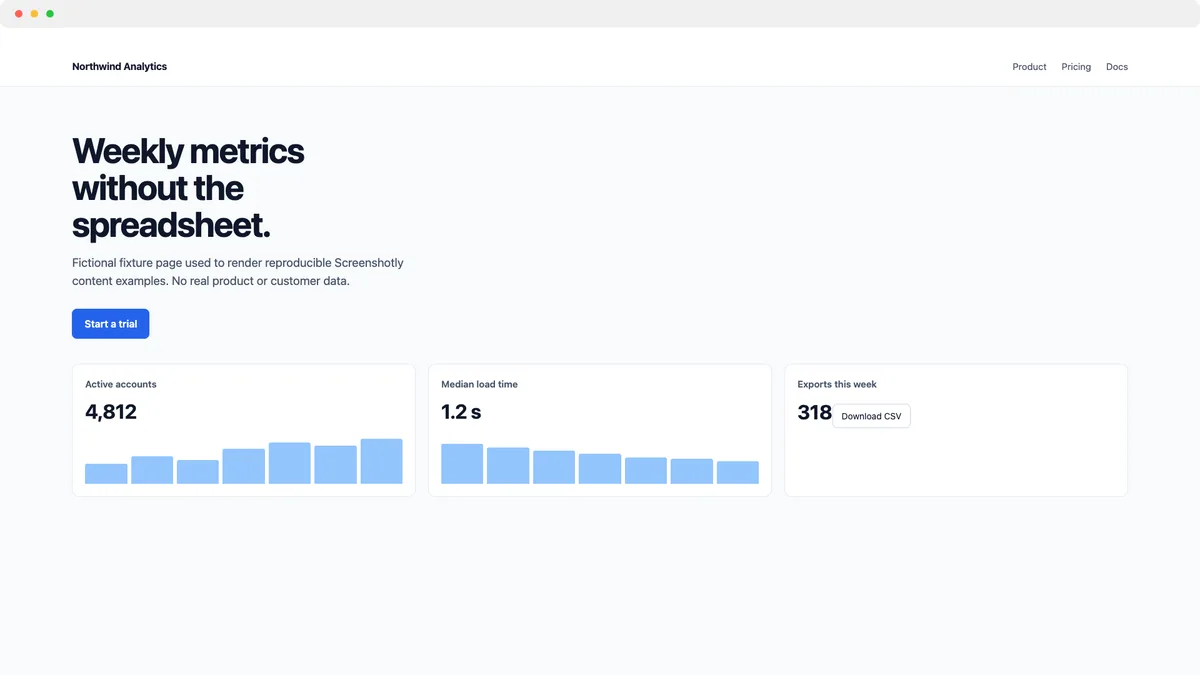
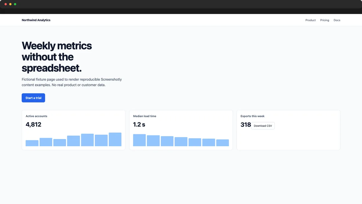
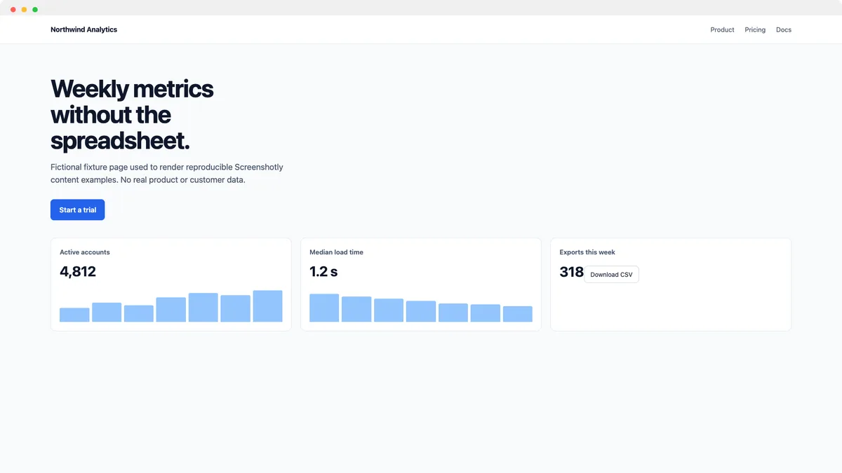
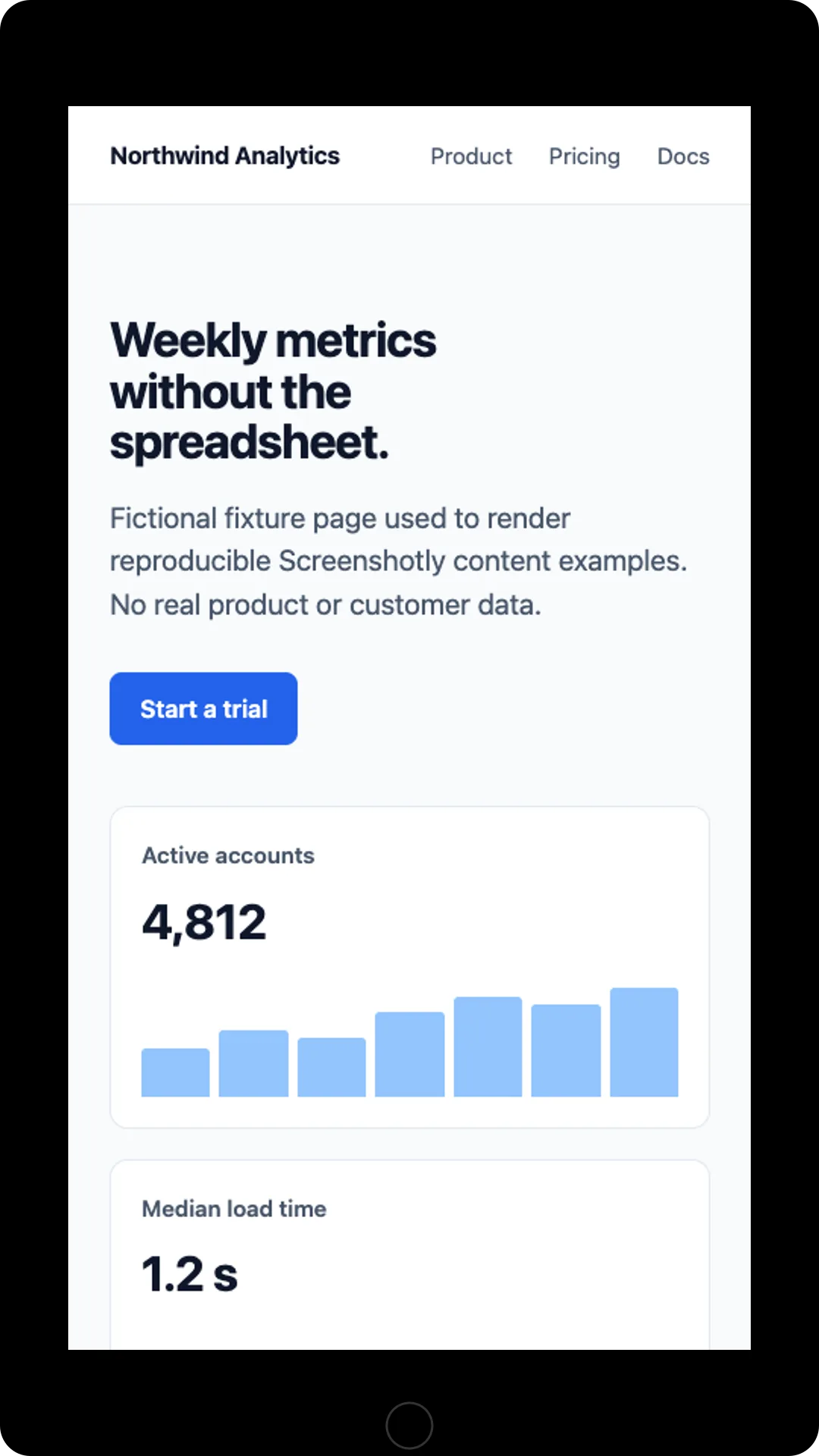
Browser and phone frames.
Rendered from a fictional local page with the product’s own compositing code (scripts/content-fixtures/render-feature-evidence.ts). These are not customer captures.
Request
Clean the page, then frame it.
curl -X POST https://screenshotly.app/api/screenshot \
  -H "x-api-key: $SCREENSHOTLY_API_KEY" \
  -H "Content-Type: application/json" \
  -d '{"url":"https://example.com","width":1920,"height":1006,"blockAds":true,"mockup":"browser-light","format":"png"}' \
  --output framed.png
blockAds hides common cookie banners and ads first. See cookie banner removal.
Limits
What to check before publishing.
- Growth plan or higher; otherwise HTTP 403 with
minimumPlan: "growth". - No
mockupOptions: colour, orientation, and shadow are not configurable. - Do not combine
devicewithwidth/height; the preset wins and none of the presets match a frame exactly. - Avoid
fullPage: the whole page is squeezed into one screen. - Viewport captures currently skip web-font downloads, so check text-heavy shots for fallback fonts.
- PDF ignores the mockup; HTML and WebM return HTTP 400.
FAQ
Before you frame.
- Which plan includes device mockups?
- Growth and Scale. On Free or Basic, a request with mockup set returns HTTP 403 with error "Plan upgrade required" and minimumPlan "growth".
- Which template IDs can I use?
- browser-light, browser-dark, browser-minimal, iphone-14, ipad-pro, and macbook-pro. Any other value is rejected with HTTP 400. GET /api/mockups returns the list as JSON.
- Can I change colours, orientation, or shadows?
- No. The template ID is the only mockup control, and the request schema rejects unknown fields such as mockupOptions. Add backgrounds, padding, or channel sizes in post-processing.
- Why does my capture look stretched?
- The capture is resized to fill the frame’s screen area exactly. Use a viewport with the same aspect ratio, for example 1920 × 1006 for the browser frames or 450 × 820 at deviceScaleFactor 2 for iphone-14.
- Which output formats work with mockups?
- PNG (default), WebP, and JPEG are framed. PDF output ignores the mockup. HTML and WebM cannot be combined with a mockup and return HTTP 400.